
Paul Park: Visualizing Medicare Data
Data
Prescription data for people on Medicare was released by the government for the year 2013. Prescription data is generally very privileged information and hard or even impossible to come by because of its potential value, so the current release of the prescriber data is bound to be popular.
- The text file is approximately 2.9 GB with nearly 24M entries amounting to $76B
- Each entry has the prescriber, prescriber's city and state, type of drug or service prescribed, and the total cost associated for the particular service prescribed by the prescriber (a prescriber can have multiple entries)
Pandas for Python on my personal computer was unable store the entire data set in a single DataFrame (the kernel would run out of memory), so just the process of reading in the data in a meaningful manner proved to be an interesting challenge, which I think ties into the new methods being developed purely for streaming large data sets.
Before considering how to store the data, I wanted to visualize the total cost of prescriptions in a given region either by ZIP code or by county based on the city and state information that is provided. CartoDB is a great website for making beautiful interactive plots on maps, and the plot below is an embedded figure made through CartoDB. In order for CartoDB to actually plot geometric shapes corresponding to a region, one must include data for the shape of the region (such as a Shapefile) and join it with the data of interest using some identifier for the region as a key.
For the granularity of the data, I decided to look at the county level, because CartoDB could not handle the entries for all ZIP codes (approx 43K in the US as opposed to approx 3K counties). The challenge then was to figure out which county a particular city and state belong to. Counties are identified by FIPS (Federal Information Processing Standards) codes. There are data sets that match the primary city of a given ZIP code to a county and state, and there are also data sets that match a FIPS code to a county and state. A left join was performed on the two data sets using the county and state as the key. Note that the ZIP code data set uses an abbreviated state code while the FIPS code data set uses the full name of the state. The joined dataframe was used to identify the FIPS code for each entry in the medicare data under the assumption that the cities in the medicare data are all included in the list of primary cities in the ZIP code data.
Visualization with CartoDB
Zoom out to see Alaska and Hawaii!
Identifying Underserved Counties (Diabetes)
Notice how the color representing the total cost of prescriptions differ from county to county. An interesting study would be to figure out whether there are any underserved counties. There are many factors to consider before deciding whether a particular county is underserved or not. Population and number of providers are all important factors. One of the biggest challenges is perhaps the fact that the current Medicare costs as visualized reflect prescriptions for all types of services regardless of what condition or disease is being treated. It would be useful to know for a certain disease, how the costs for the affected population in a given county compares to that of its peers. Diabetes (type 2) can be a good example because of how well documented it is in terms of prevalence for each FIPS code. It is also possible to classify whether a certain prescription treats diabetes by seeing if the brand of drug belongs to a list of known brand of diabetes medications listed in WebMD, which sum to about $6.7B, a sizeable amount of total Medicare costs.
The map above has three buttons that allow the user to toggle between a color map of Medicare costs, Medicare costs for treating diabetes, and diabetes prevalence. The first thing I will do is graph a scatter plot of the diabetes prevalence against diabetes cost for counties that have values for both. Because of the difference in magnitude for the two quantities, I will normalize each by dividing by their respective maximums such that the values scale from 0 to 1. While there seems to be a strong linear trend (which probably is not surprising), the distribution of points are heavily skewed, so I decided to also look at the scatter plot on a log scale for both axes.
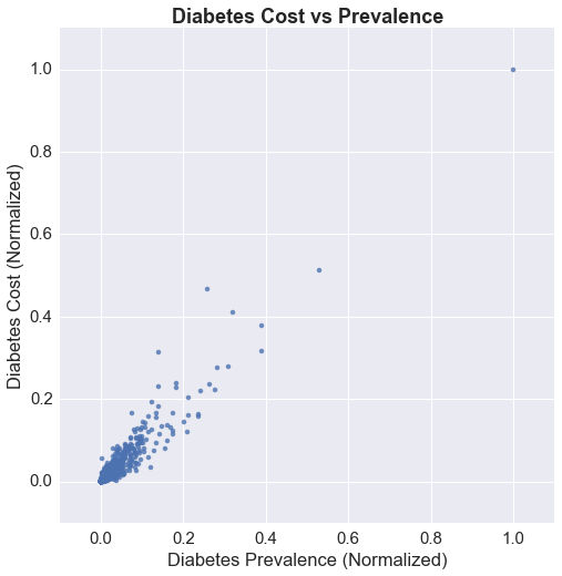
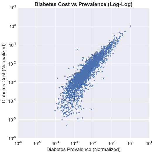
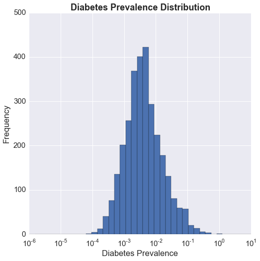
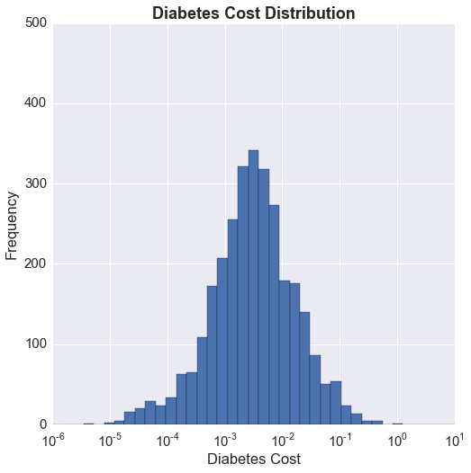
There seems to be a lobe that drops off from the linear trend closer to 0 on the x axis (prevalence) indicating lower costs compared to prevalence, which suggests that there are counties that may not be receiving as much treatment in terms of prescriptions as would be desired. Perhaps this is an issue that could be explored further. The plots below show the distribution of the normalized prevalence and cost. The x axis is on a log scale, and we can see that the distributions for both are log-normal. This is always something I have wondered about, and that is, I think it is important to recognize that a distribution is log-normal, but the following question is, how should I use it? It is fairly clear to me that having the x axis on a log scale gives me a better picture of the distribution, but is a more uniform distribution desired, or the heavily skewed one? If I can define what it is that I am looking for, perhaps I can understand how to use this fact.
For now, I'm going to keep things simple and look at the cost/prevalence ratio using the normalized values. Below is a look at the distribution on a log scale.
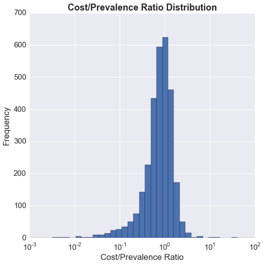
The distribution is not bimodal, but regardless, the question I would like to answer is whether there are essentially two groups: a group of underserved counties (cost/prevalence ratio << 1), and a group of counties where the cost/prevalence ratio is close to 1.
Next Steps?
I was wondering if there is an unsupervised clustering algorithm that could identify clusters without me having to specify the number of clusters I'm looking for. DBSCAN from Python's scikit-learn seems like a good candidate for that. I would also need to determine whether the results are significant.